Drawing Interior Lighting
I thought this was one of those ‘too hard’ subjects to draw. (More on this next blog).
But I love the interiors as much as the outsides of the grand buildings and wanted to capture something of them in drawing for the same reasons I love to draw the exteriors. In fact, there are often greater possibilities in shadow and form inside a building.
Here’s some of what I’ve learnt:
Examine the subject carefully and identify all the light sources – interior and exterior. Work out what the brightest lit part of the interior will be and where that light comes from. Be aware that sometimes the objects immediately around a light source on the page may be some distance away in life and therefore not lit by it at all. (E.g., a ceiling).
Outline any area which will stay pure white. This also reminds me to take care when my pencil approaches these areas.
Sort out where the darkest shadows will be. I think the most dramatic drawings are done when virtually the entire drawing is in some shadow, from very light to very dark.
I do a 3h pencil outline of the main details of the scene. (I find 3H doesn’t smudge when I later rest my hand on it). This then lets me concentrate solely on getting the relative shadows correct and not having to worry about line placement at the same time.
I like to create my shadows using line, rather than tone. Either, or both, is fine, but I think it helps the cohesiveness of the finished work to make a deliberate choice.
One way to approach the shading is to lightly shade the whole drawing except the brightest highlights and then keep adding shading to the darker areas until it all comes into place. Keep adjusting until it’s right. (But you’ll have to be careful not to smudge previous linework). A little eraser work can help re-establish areas of brightness if necessary. I have attached a few of my favourite interior-lighting drawings below which to illustrate what I’ve been saying.
Remember that perspective is just as important inside a building as outside.
If you’ve never tried this subject before, give it a go! You get better at whatever you practice.
Today’s Instagram post which prompted this blog. Note how the closest chandelier is really just suggested with some curly strips. As in life, the bright light draws the eye.

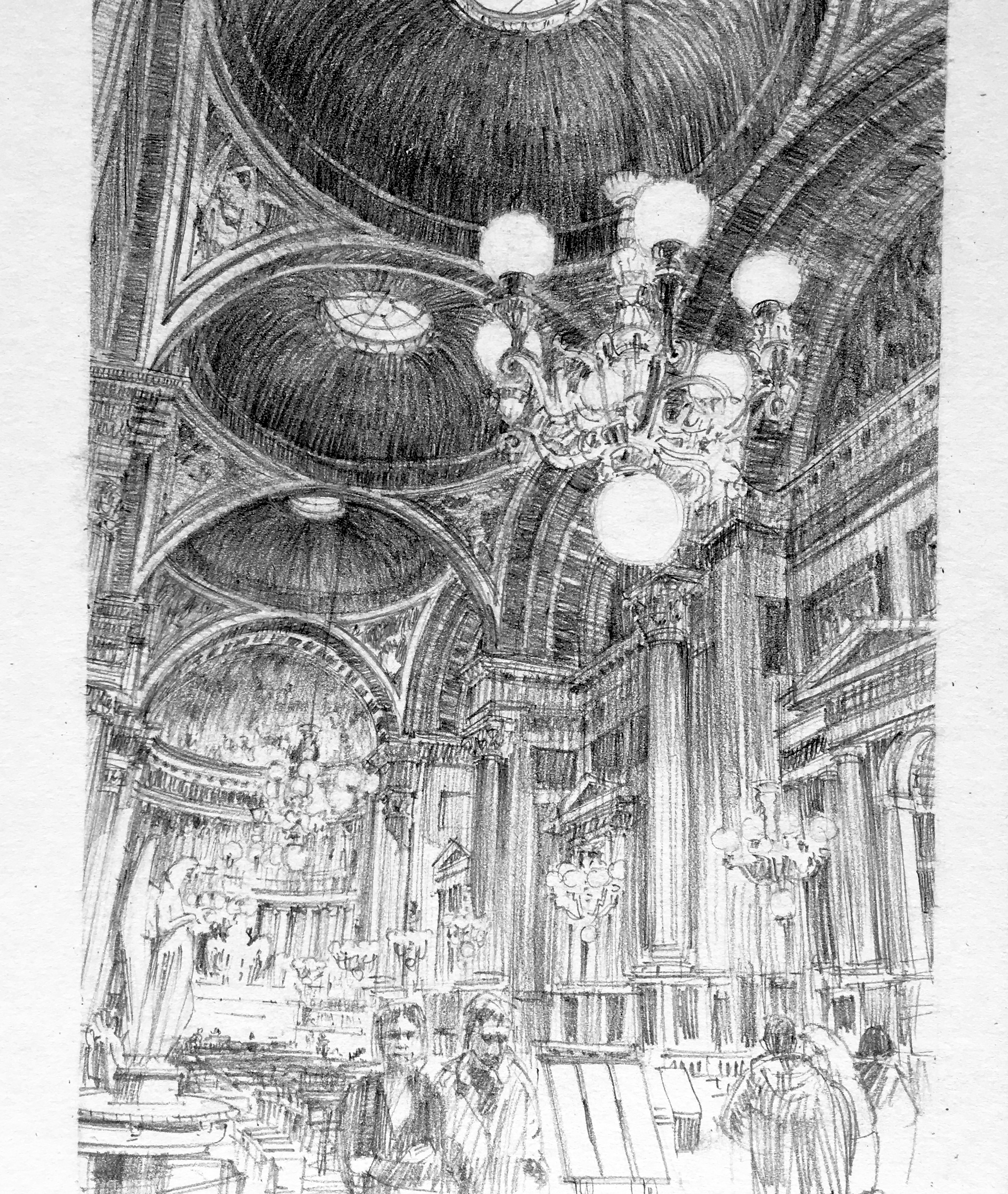
In this Notre Dame interior, the main light effect is across the middle of the drawing from the chandeliers, but there was also the secondary light source of the celestory windows high in the nave walls to consider.
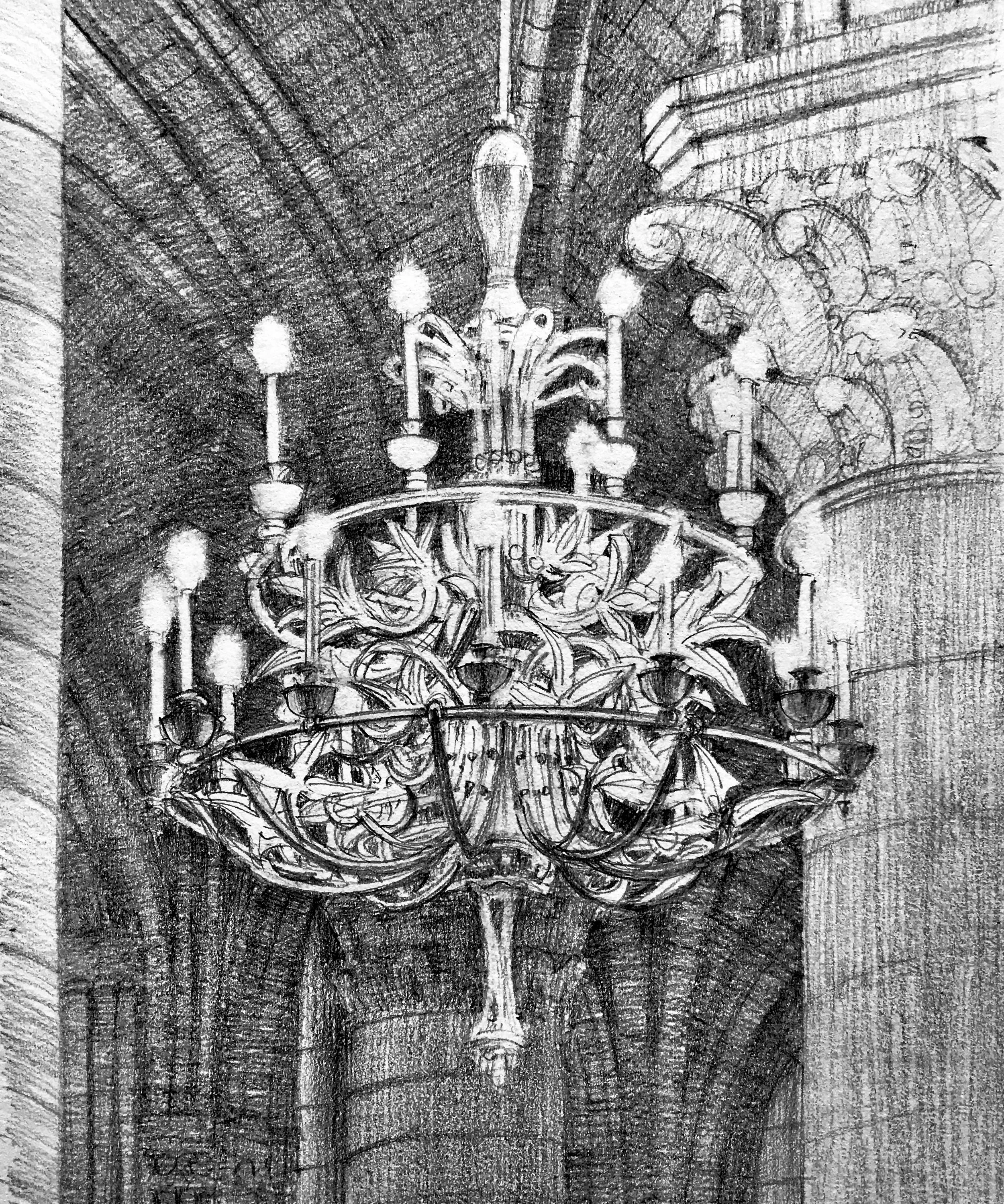
In this drawing of a chandelier in Notre Dame, I drew most of the chandelier by negative space (See Blog #2). Then I added the bracket lines into the spaces I’d created, starting with the closest. Half the actual detail was left out, but the effect was satisfactory. Trying to draw the actual chandelier arms would have been impossible for me on the scale of this drawing.