[I have several YouTube videos on keeping elements of a drawing in proportion to each other on my YouTube Channel Stephen Travers Art if you want to see more and watch me demonstrate this method ]
Proportion in sketching is getting all the parts of a drawing the right size in relation to each other, and the drawing the desired size in relation to the available paper. It overlaps with a discussion on perspective, as proportion is one of the ways a sense of perspective is created.
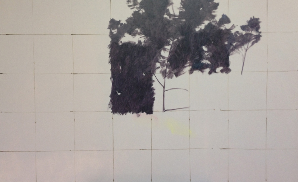
When drawing complex images from photos in the studio, I usually use a grid system: ruling a 4 x 4 grid over the photo, and, in the same proportions, on the drawing paper. This allows me to transfer the significant lines of the image quickly and accurately, and lets me get to the parts of the drawing process I personally find more interesting. It also solves the problem of drawing the parts of the image in proportion to each other. Below is an image of a recent drawing at the pencil guideline stage with the grid clearly visible. In this case, the pencil is erased after the pen line work is completed and before tone is applied.

The gridlines are the ruled straight lines 3 across and 3 down., creating a 4 x 4 grid.
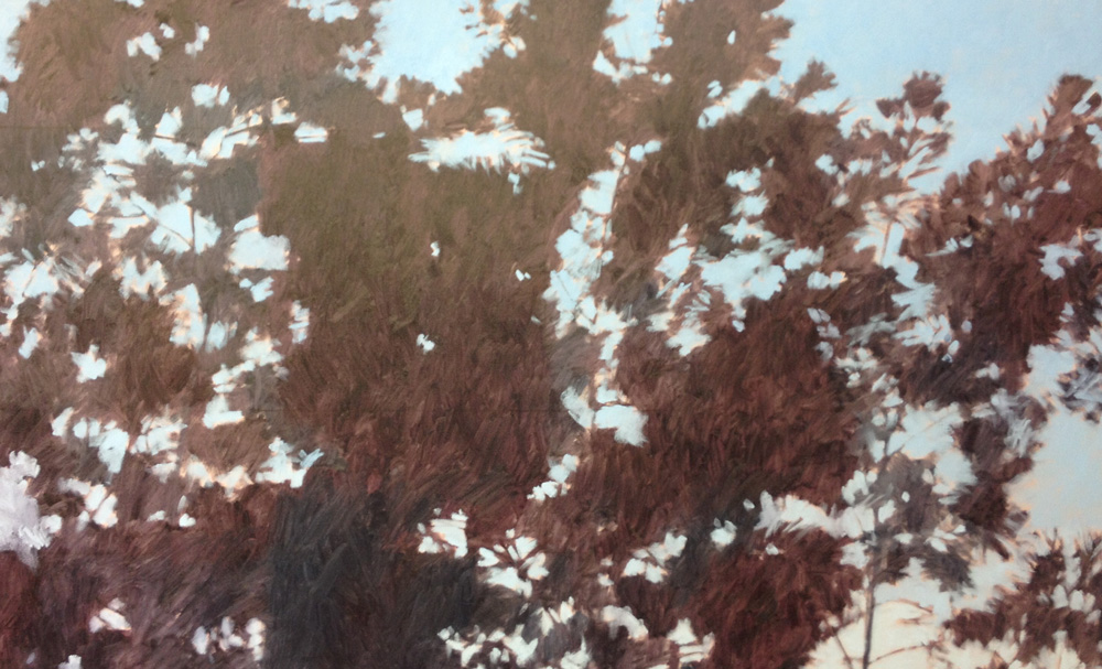
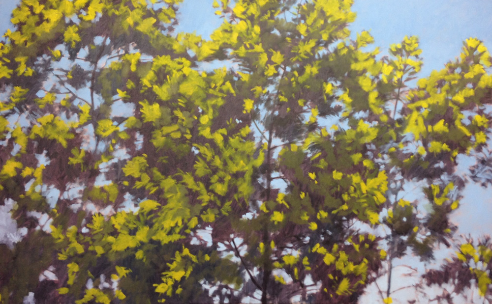
The finished work with all the pencil erased gives no indication of the grid.

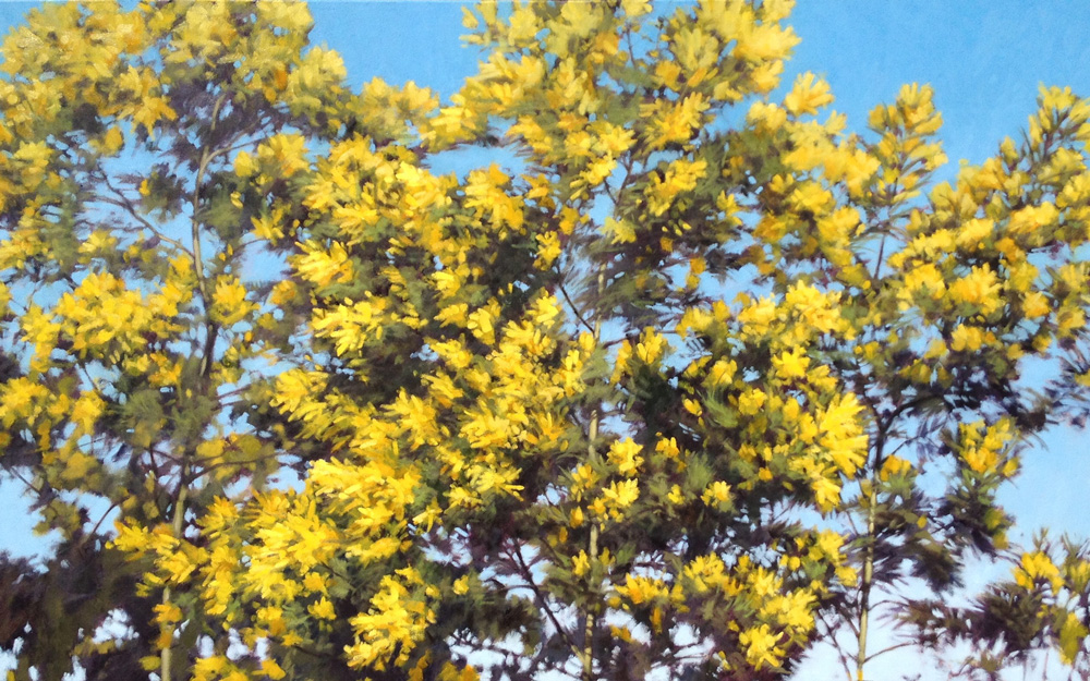
The finished image as posted on Instagram. Proportion made simple with a grid.
However, when location sketching a grid is clearly not possible. My approach is first to draw a certain section of the overall building carefully, and then to use this section as a reference for the rest of the building. This works well for quite complex buildings and perspectives.
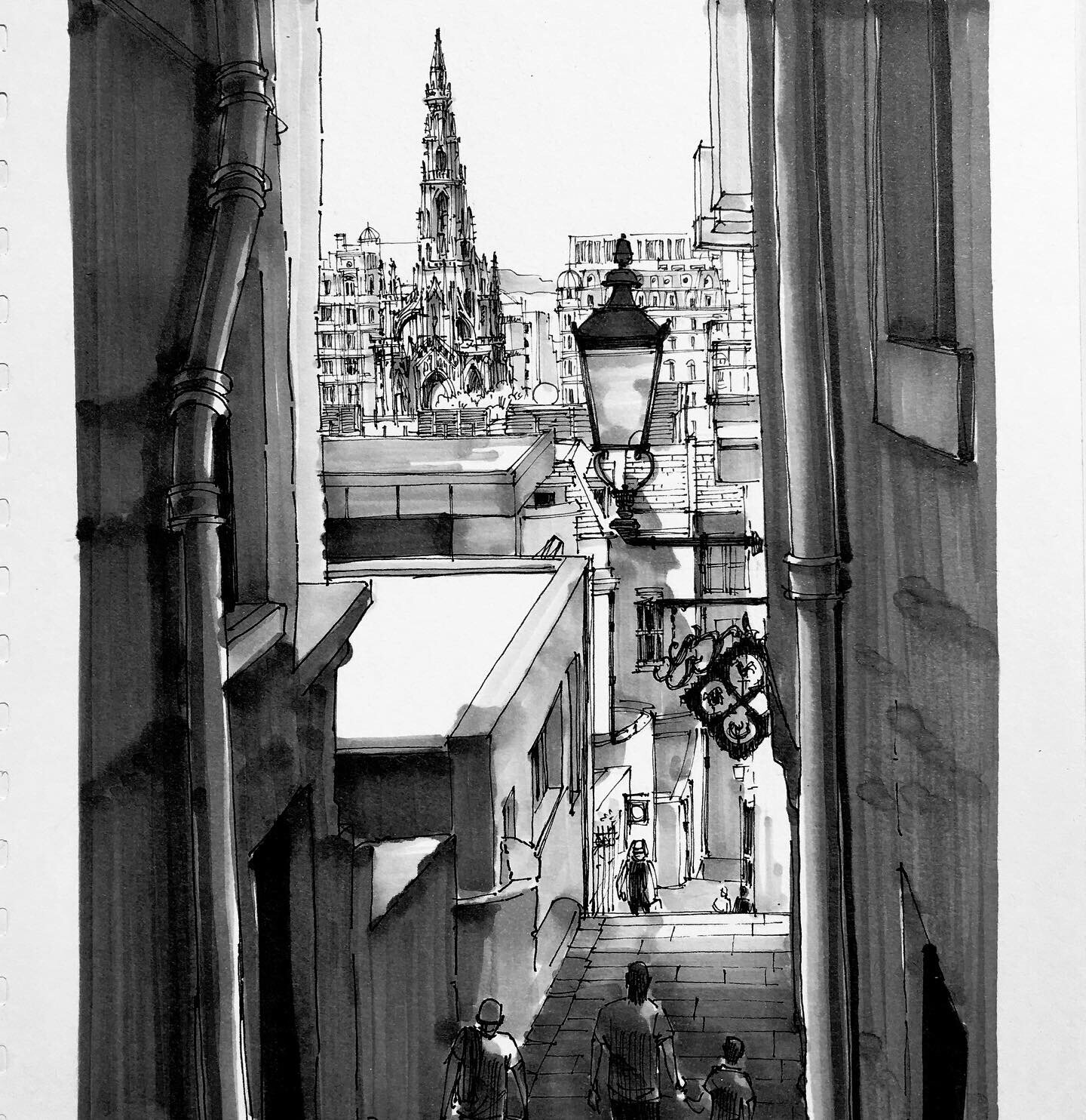
Below is an image of the Sydney Town Hall showing the view I sat and drew on location last September.

This is pretty much my view of the Sydney Town Hall as I sat and drew it.
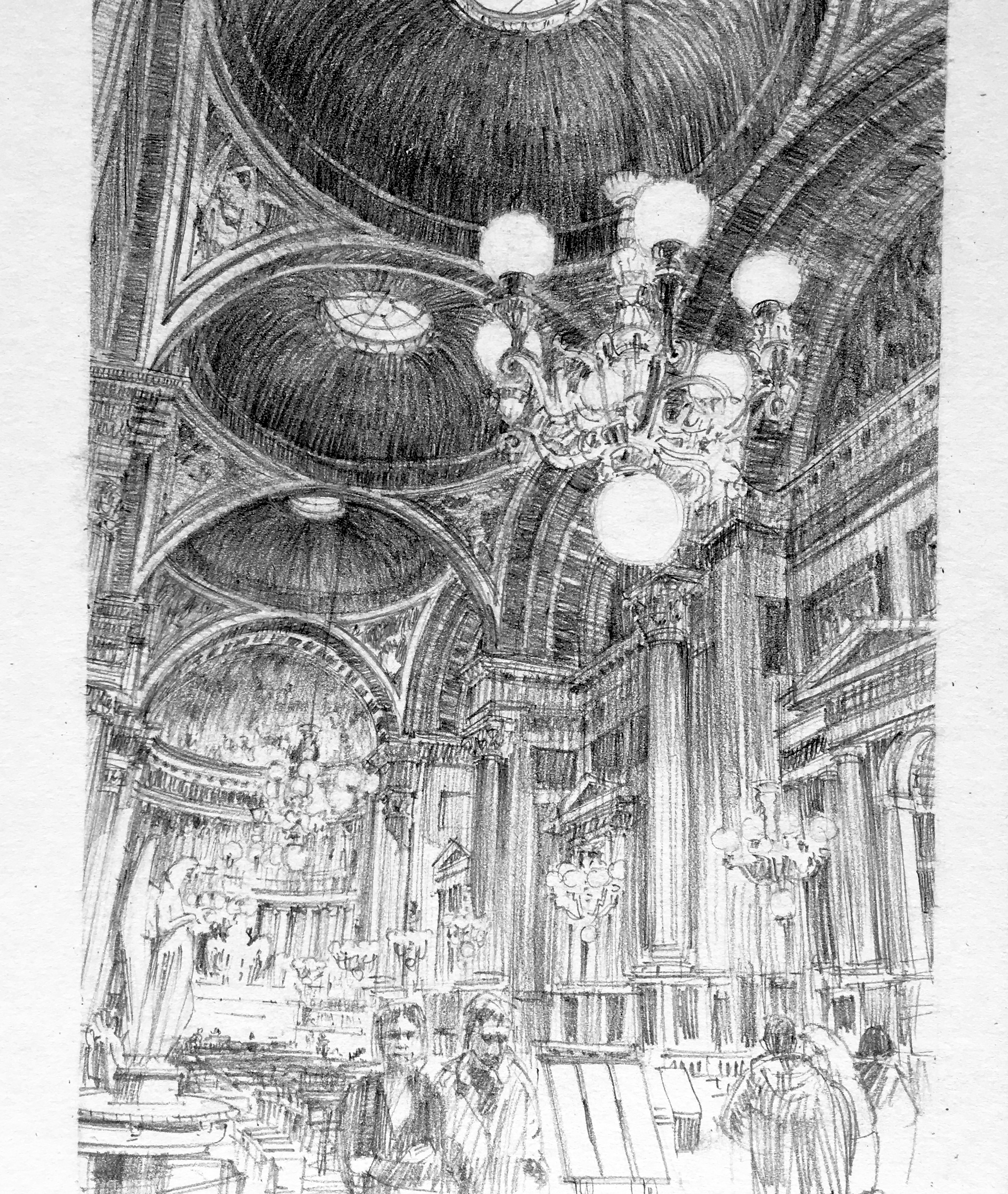
The next image below shows a composite of the initial section I drew, and of the finished drawing. I used that first square of detail on the left as a basis to judge the proportions of the rest of the building.
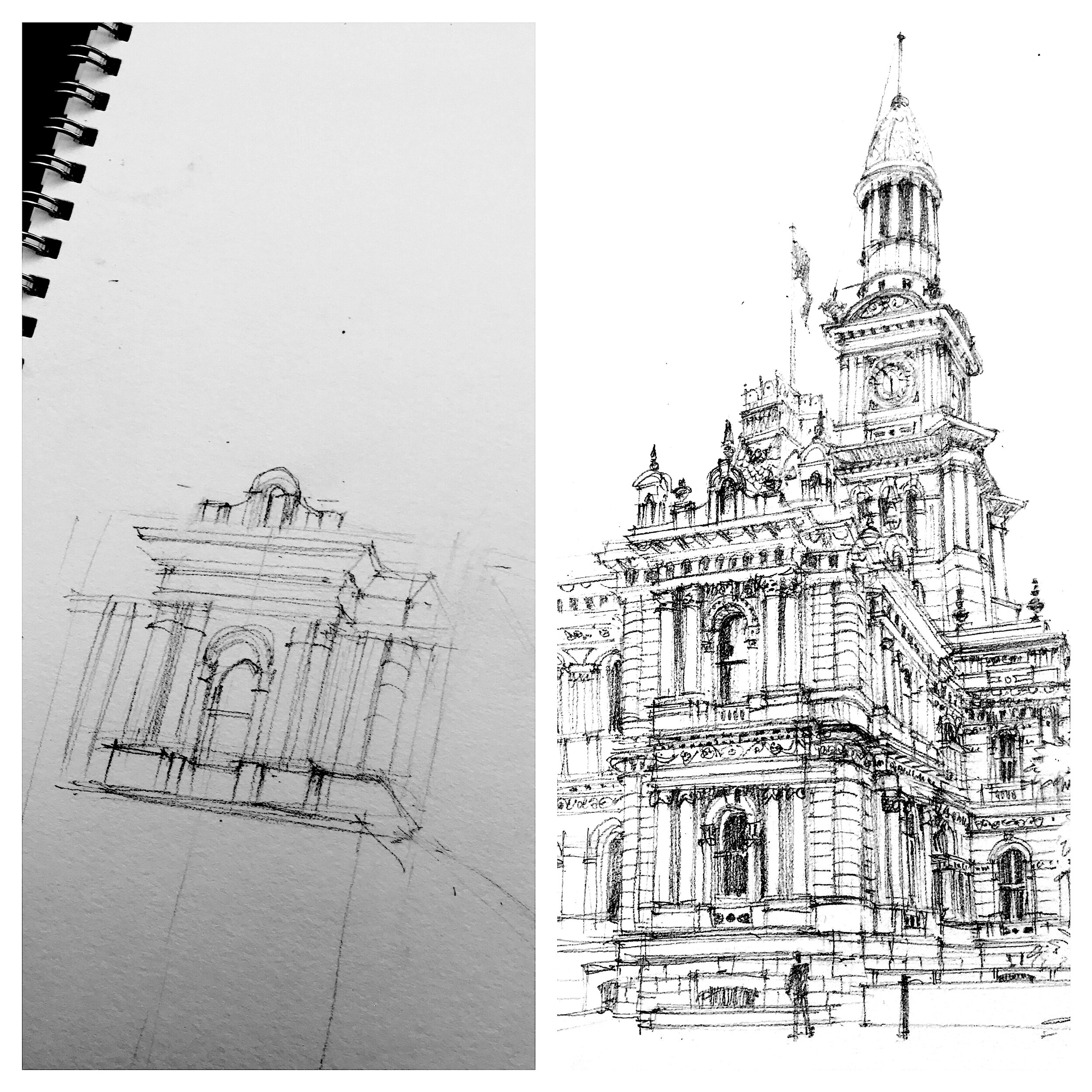
Using my pencil as a ruler, I would hold it up against the Town Hall and judge the size of other parts of the building in relation to that first section I’d drawn. So if, for example, the tower in life was half the height of that first section as measured with my pencil-ruler, I would draw it on the paper half the height of the size I’d drawn that first section. Minor detail I usually just judge by eye. Being a pencil drawing, all the lines on the left side first section of the drawing are visible in the final stage.
Proportion is important in creating a credible sense of perspective, understanding how similar sized objects change in size on the paper as their distance increases from the viewer. But this is probably best discussed in a blog on perspective.
Proportion is also important in fitting the overall image I want to draw on the size paper I have available. Using the pencil as a ruler held up in front of the building and choosing a section of the building and using that as a reference for the overall size of the building should mean I start the drawing proportioned so the whole thing will fit on my page. But it doesn’t always work out, as the abandoned drawing below shows:
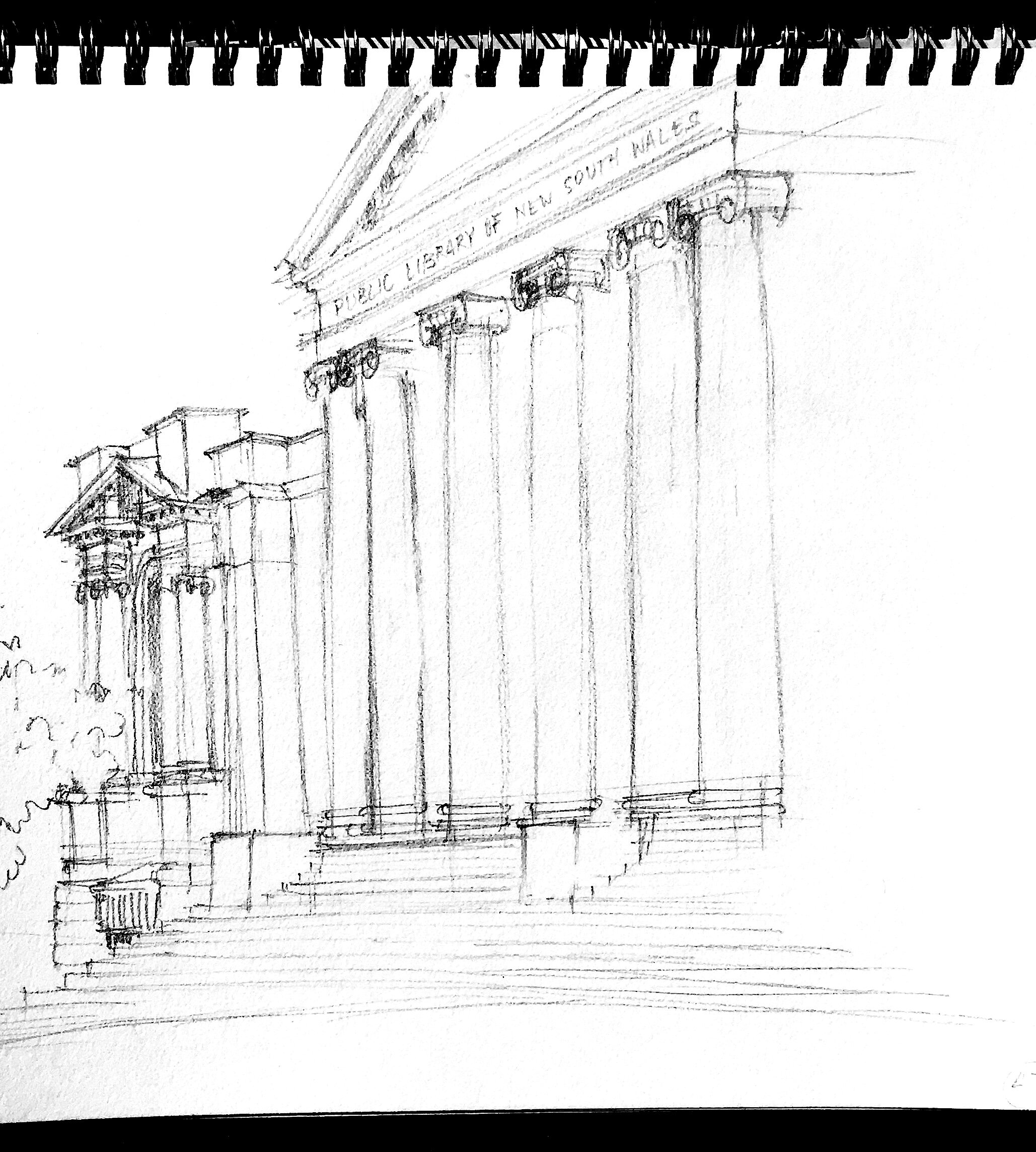
The whole pediment of the State Library of New South Wales was meant to to be on the page! Do you know this feeling?