[I now have several YouTube videos on this topic on my channel Stephen travers Art if you’re interested in more detail than in this blog.]
I was asked this question today on my Instagram Account, so I thought I’d give it a go:
Analyse the Depth Before Drawing:
Whether on location, or from a photo, analyse the scene and decide how many separate planes you want to represent. - foreground, mid-ground, background, far background - for example. You need to stay aware of what components of the scene lie in which plane as you draw.
Line Work:
Strongest, sharpest, thickest, clearest, darkest lines will appear closer, so use these for closer objects. Lighter, finer, more feathery lines will generally appear further away than these lines. I tend to use 0.3, 0.2, 0.1 and 0.05 fineliners in this way for the separate planes.
Detail Comes Forward:
The closer objects are, the more detail is usually visible, so more detail on closer objects, less on further away. This is the general principal, but allowances may need to be made for the intrinsic detail in an object, or where the focal point of the overall drawing lies. Closer trees need more lines defining their shapes when they sit forward. Further back trees need shorter, lighter, finer lines suggesting much less detail.
Dark, Strong, Bright colours Come Forward:
This is more obvious in painting, where bright, rich, deep colours look closer than duller, lighter colours. If using tone for shading or local colour, this needs to be taken into account for depth perception. Different tones of black/grey ink could be used in the line work to increase this effect.
Light/Dark:
Shadows are darker when they are closer to us, so varying the darkness of shadows is important in creating a sense of depth. However, a lot of other factors have to be simultaneously accounted: the actual depth of the shadow, reflected light, local colour of the shaded object, and what other elements are being juggled, such as details.
Perspective:
Perspective indicates distance - get it right and everything sits further back as it should. It’s particularly important to get the perspective correct with figures. People need to be affected by perspective as much as the buildings around them if they are to help the brain understand the are further away - as do trees, vehicles and any objects which may be repeated in a number of receding planes.
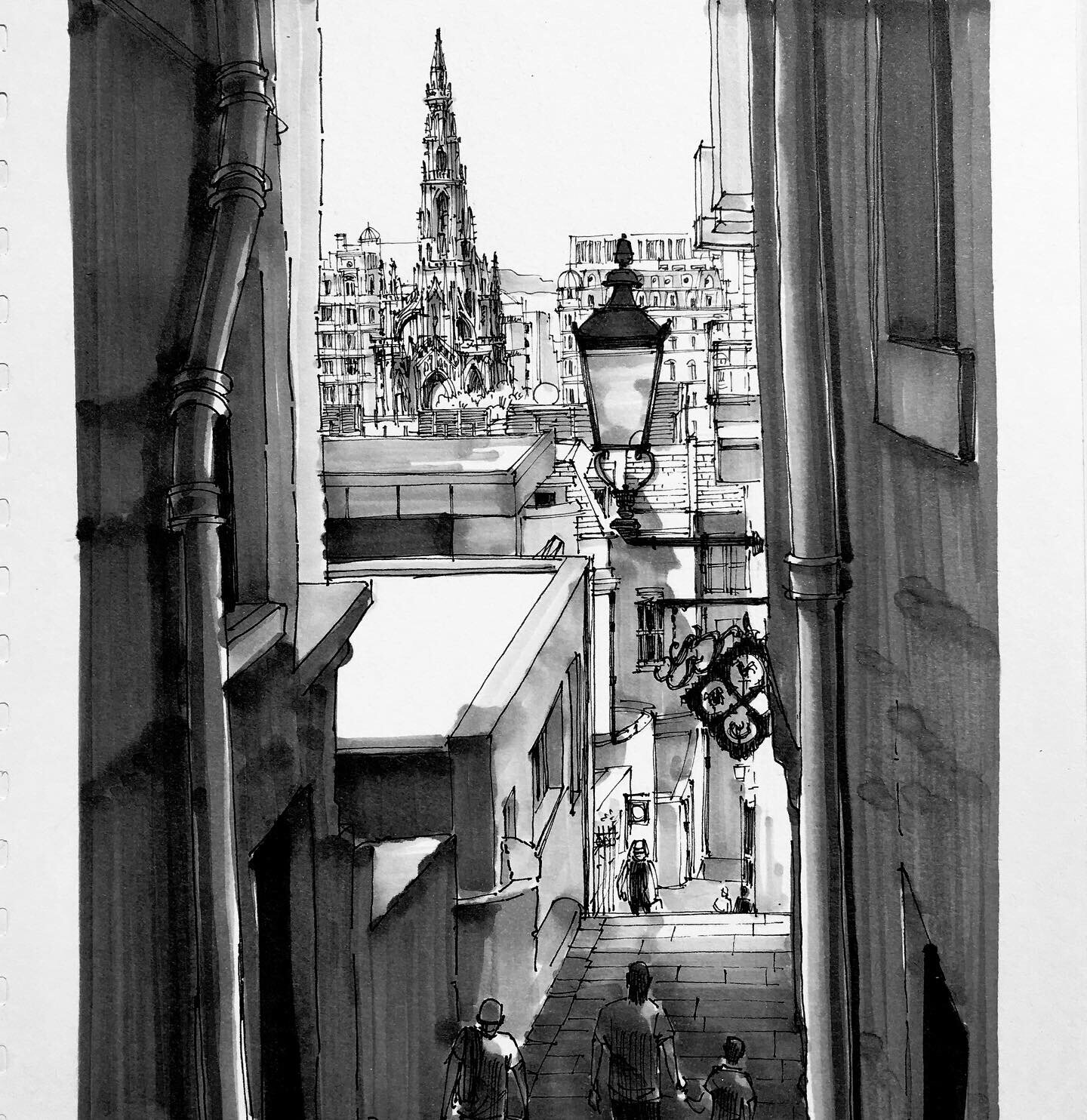
Today’s Instagram post illustrates these principles. It is complicated by the fact that the most detail is on a structure in the background - the Burns Memorial in Edinburgh. The foreground is relatively sparse for details. If I were doing it again I would work more at representing more surface texture on the two framing wall. This would also have made it easier for me to apply the dark marker. See how the lamp sits in front of the background details. Even though the background has more details, the lines are light and feathery, compared to the strong, dark lines of the much closer lamp.
The following illustration shows the four separate sizes of markers each used for a different plane of detail.

These four photos show the various stages of using a 0.3, 0.2, 0.1 and 0.05 fine liner in representing receding planes before the marker is applied.